Newsletter Modal
For this design challenge, I developed a modal utilizing succinct microcopy to encourage users to sign up for an online newsletter.
A Design Challenge
OVERVIEW
Create a newsletter sign-up CTA (call to action) modal for a business. Focus on providing a succinct and interesting microcopy.
Problem
Solution
Designed a captivating modal pop-up that directs the user's attention to important text and a call-to-action button.
Project Scope

Image 1.1 - A highlight of the role I played in this project: I was the sole designer and given one week in Figma to complete this assignment
RESEARCH
The main focus of this challenge was to provide succinct and encouraging copy, so I decided to research the topic. After reading several articles, these are the key takeaways that I would keep in mind going forward:
Understand the audience.
Provide low cognitive load.
Include reassurance text.
Use active voice and employ passive voice sparingly.
Create an attention grabbing title.
Inform users of what they get once they sign up.
Call-to-action text should be similar to the overall theme of the microcopy.
Understanding Microcopy
Understanding the User
Since this was an open-ended design prompt, I created the scenario that my modal would be on a cat rescue website that provides information on cats currently up for adoption as well as supplemental resources. Establishing this scenario would help guide my design decisions.
DESIGN
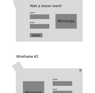
I began by creating a wireframe to visualize how I wanted to layout the modal's information.
With the design scenario being related to cats, I wanted to implement cat-related characteristics into my design. I played around with the idea of including a cat head, a cat paw, and pawprints to really hammer the image home, all the while developing a playful and cute vibe.
Sketch & Wireframes
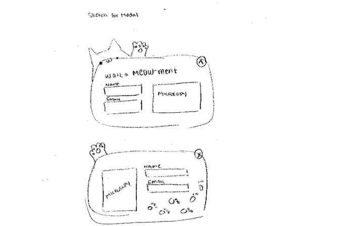
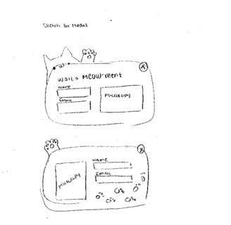
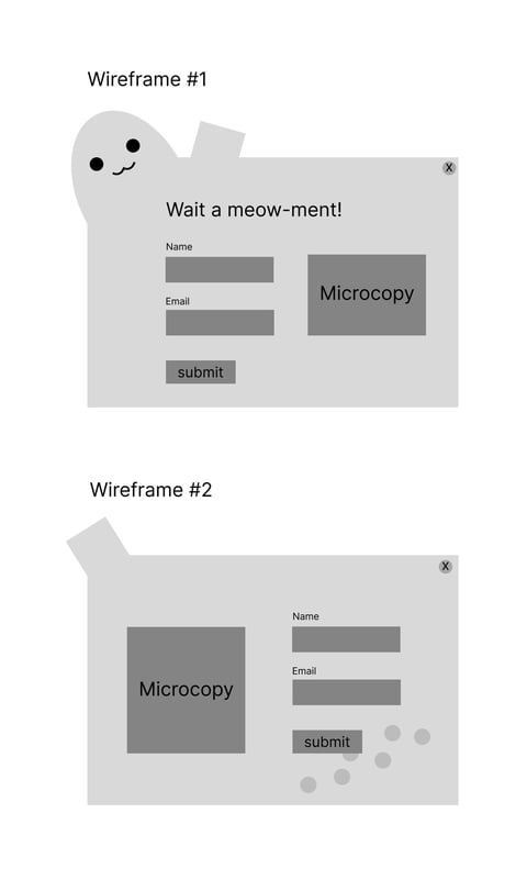
From these sketches I developed some initial wireframes.
Microcopy Justification
Hook
"Wait just a meow-ment!" Using the cat theme, I make a catchy pun to draw the reader in and keep them from leaving the page.
What we offer
"Want to learn meow-re? Subscribe to stay updated on stories, interviews, exclusive offers and more!" Continuing with the puns, I segway into what a subscription would provide: stories about the cats up for adoption, interviews with the employees and volunteers, exclusive offers from the online store, and more.
Confirmation copy
"Sign me up, meow!" Another pun, this time establishing a positive atmosphere and encouraging the reader to sign up.
Reassurance text
"Purrfection™ won’t spam you or sell your data. Check our Privacy Policy for more information. Unsubscribe any time." Assure users that they will not be spammed and that their information is safe with the company. I also provide a link to the Privacy Policy and a link to Unsubscribe.
Color Psychology
For this design, I decided to focus on four colors. I selected a salmon pink because it communicates playfulness, health, and vibrancy. A light grey, dark grey, and muted pink were also chosen to balance out and tone down the vibrant pink.

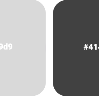
Image 3.1 - The initial sketch of the modal design. When designing this sketch, I already had the idea for the product I would be advertising (a newsletter subscription for a cat adaption service), and from there I had words and themes in mind that I used to guide my design.
Image 3.2 - The initial wireframes of the modal design. Two designs were made and from the two I chose the top design to build off of.
Image 3.3 - A swatch highlighting the four main colors chosen for the modal.
FINAL DESIGN
The final design is based off of Wireframe #1, with few changes made to decrease visual noise (changing the paw from being an extra protrusion to being the "X"-button).
High Fidelity
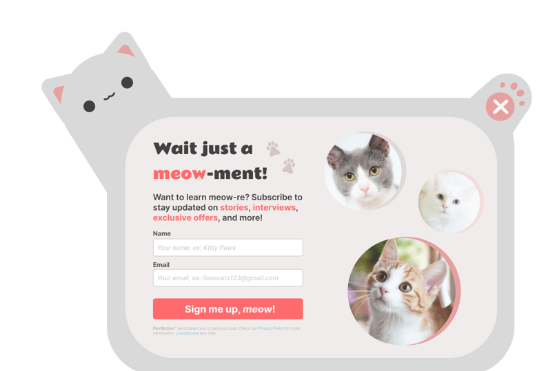
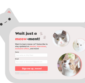
Image 4.1 - The final design for the modal advertising a subscription to a cat adaption newsletter.
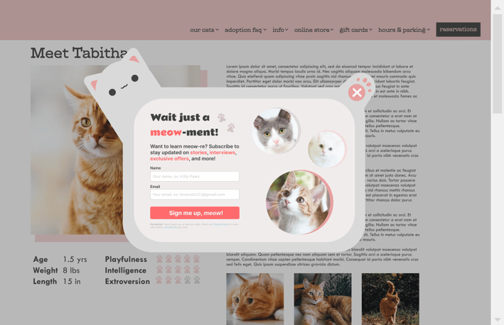
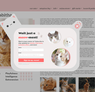
Image 4.2 - The final design for the modal advertising a subscription to a cat adaption newsletter in context.
work / spicely case study / general mills redesign / sharepoint redesign / rx tracker redesign / newsletter modal / wcag design